Airbnb Dashboard
// Context & Background
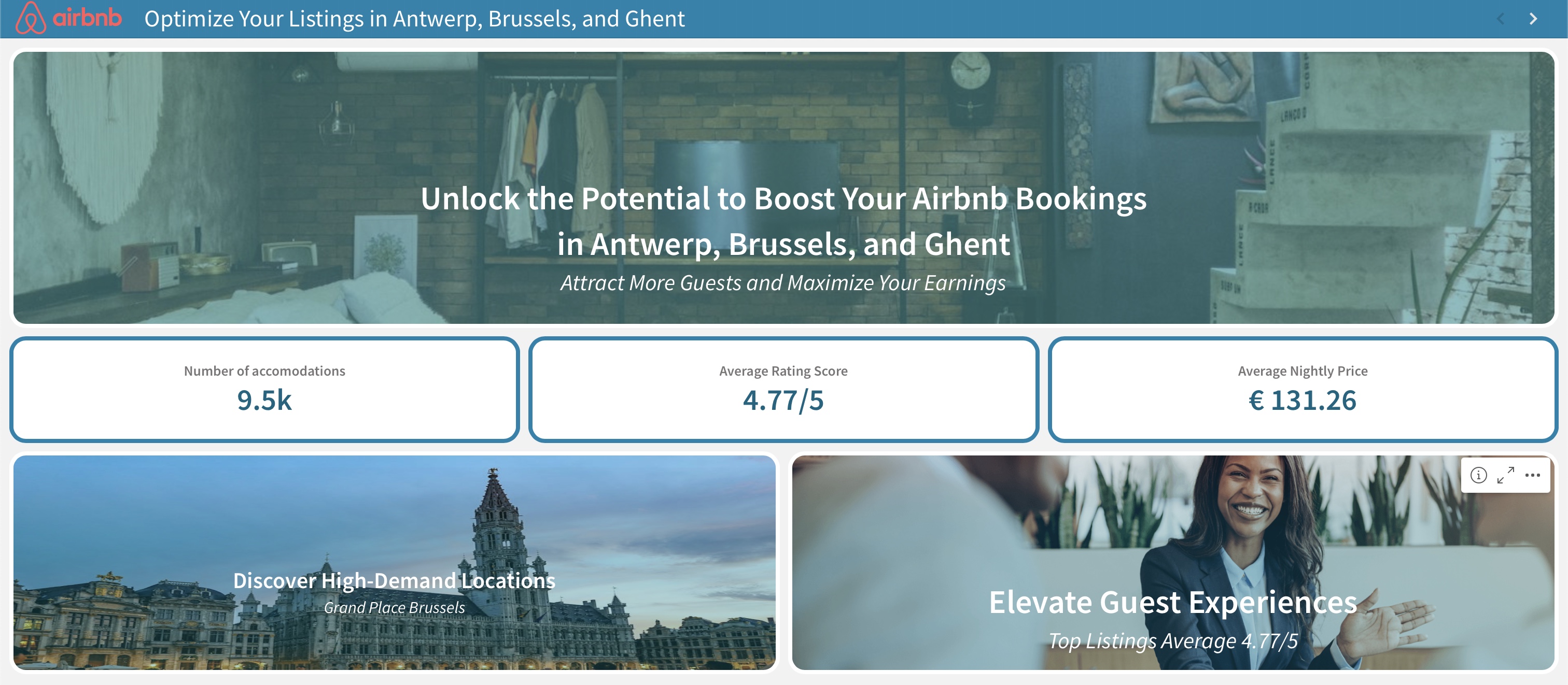
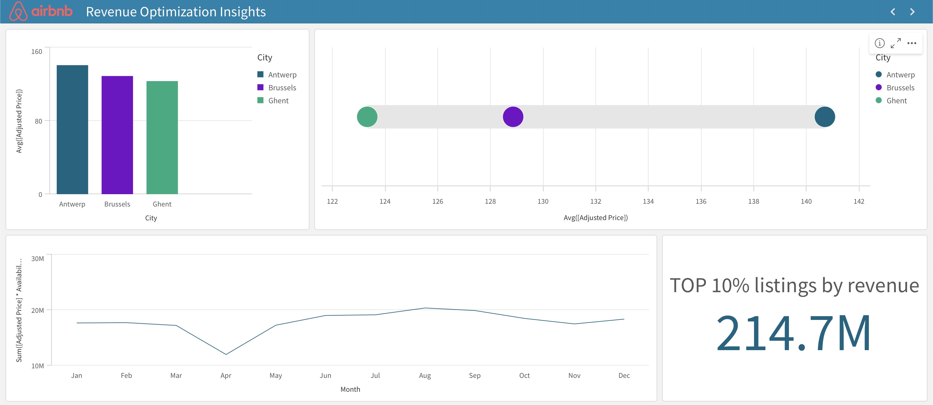
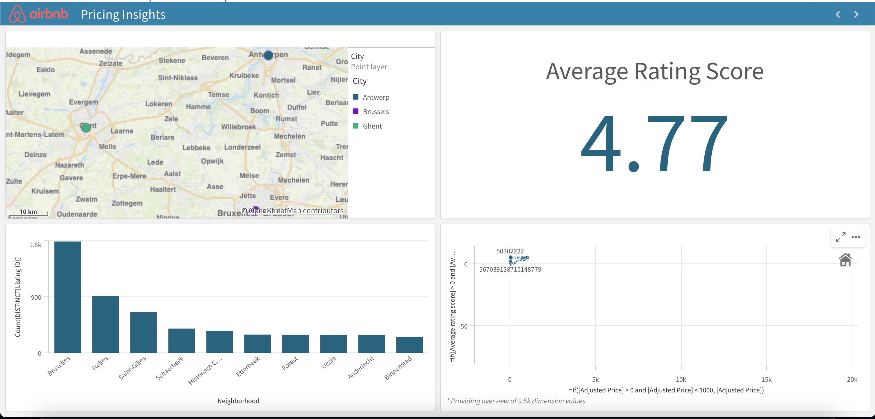
This project was part of the Data Visualisation course at Thomas More. I developed an interactive dashboard for Airbnb data using Qlik, a powerful data analytics platform. The dashboard aimed to provide insights into listings, pricing, and user trends, making it a highly engaging and enjoyable project for me due to its creative and analytical aspects.
// My Contributions
I designed the dashboard layout in Qlik, selecting relevant data visualizations such as charts and heatmaps to represent Airbnb data effectively. I cleaned and processed the dataset to ensure accuracy and created interactive filters for users to explore trends. My focus was on making the dashboard intuitive and visually appealing for end-users.
// What I Learned
This project deepened my understanding of data visualization principles and Qlik's capabilities. I learned how to transform raw data into meaningful insights and improved my skills in designing user-friendly interfaces for data exploration. The project's creative freedom made it particularly enjoyable, reinforcing my interest in data analytics.